
Choosing Visualization with Matplotlib as Example
When it comes to data visualization, the first and the most critical step is to select the correct visualization for the data that you want to present. With a wide range of visualization software that is available offering a large number of chart varieties, it’s often confusing to pick the right one, which explains the data and insights in the simplest possible manner.
Most of the data can be visualized with some different visualization. Personally, for me the most used visualization are:
- Line Plot
- Histogram
- Pie Chart
- Box Plot
- Violin Plot
- Scatter Plot
But before that, lets create sample dataset using Iris
import pandas as pd
from sklearn import datasets

x = iris.data
y = iris.target
iris_df = pd.DataFrame(x, columns=["SepalLengthCm", "SepalWidthCm", "PetalLengthCm", "PetalWidthCm"])
Line Plot
Line graphs are best when it comes to plotting continuous data like timeseries or numerical count value. Since all the points are connected using a line, it’s easy to interpret continuous data, but at the same time, it doesn’t make sense for plotting categorical variables. Line graphs can be used to show a single series or multiple series of data.
When to use: Time Series should be used when single or multiple variables are to be plotted over time.
Example
plt.figure(figsize=(16,9))
plt.plot(iris_df['PetalLengthCm'])
plt.show()

Histogram
A histogram takes in a series of data and divides the data into a number of bins. It then plots the frequency data points in each bin. It is useful in understanding the count of data ranges.
When to use: We should use histogram when we need the count of the variable in a plot.
Example
plt.figure(figsize=(16,9))
plt.hist(iris_df['PetalLengthCm'], edgecolor='r',bins=20)
plt.show()

Pie Chart
It is a circular plot which is divided into slices to illustrate numerical proportion. The slice of a pie chart is to show the proportion of parts out of a whole.
When to use: Pie chart should be used seldom used as It is difficult to compare sections of the chart. Bar plot is used instead as comparing sections is easy.
Example
plt.figure(figsize=(16,9))
plt.pie(iris_df.iloc[0],labels=iris_df.columns)
plt.show()

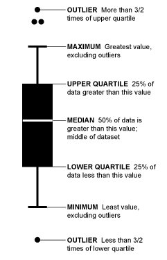
Box Plot
Boxplot gives a nice summary of the data. It helps in understanding our distribution better.
When to use: It should be used when we require to use the overall statistical information on the distribution of the data. It can be used to detect outliers in the data.
Example
plt.figure(figsize=(16,9))
plt.boxplot(iris_df['PetalLengthCm'])
plt.show()

Violin Plot
Violin plot is a better chart than boxplot as it gives a much broader understanding of the distribution. It resembles a violin and dense areas point the more distribution of data otherwise hidden by box plots
When to use: Its an extension to boxplot. It should be used when we require a better intuitive understanding of data.
Example
plt.figure(figsize=(16,9))
plt.violinplot(iris_df['PetalLengthCm'])
plt.show()

How to understand boxplot and violinplot
Scatter Plot
Scatter plot helps in visualizing 2 numeric variables. It helps in identifying the relationship of the data with each variable i.e correlation or trend patterns. It also helps in detecting outliers in the plot.
When to use: It is used in Machine learning concepts like regression, where x and y are continuous variables. It is also used in clustering scatters or outlier detection.
Example
plt.figure(figsize=(16,9))
plt.scatter(iris_df['PetalLengthCm'], iris_df['PetalWidthCm'])
plt.show()


Leave a comment